_____________________________CREATIVE SOLUTION
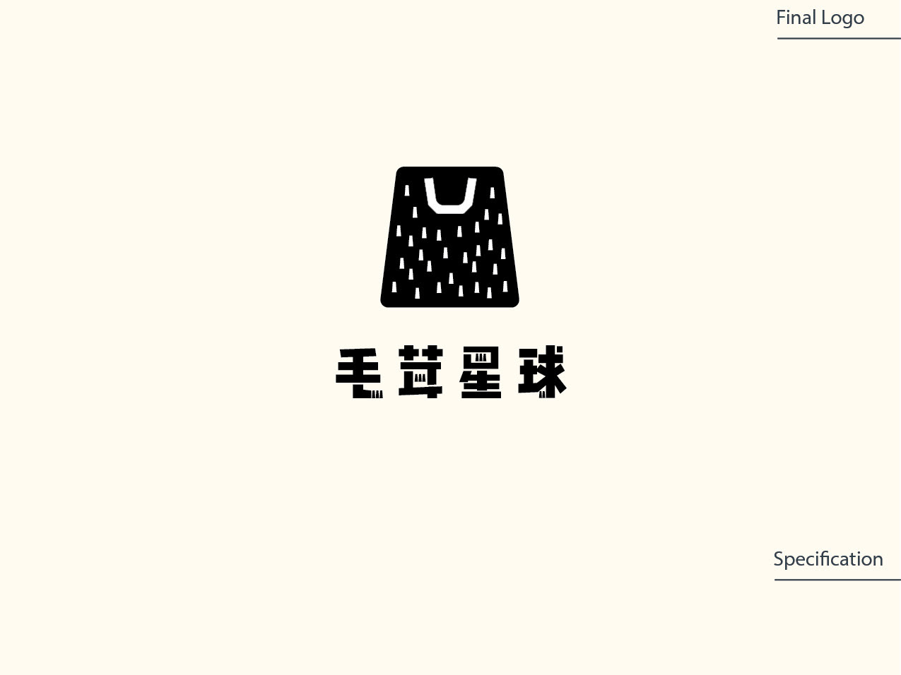
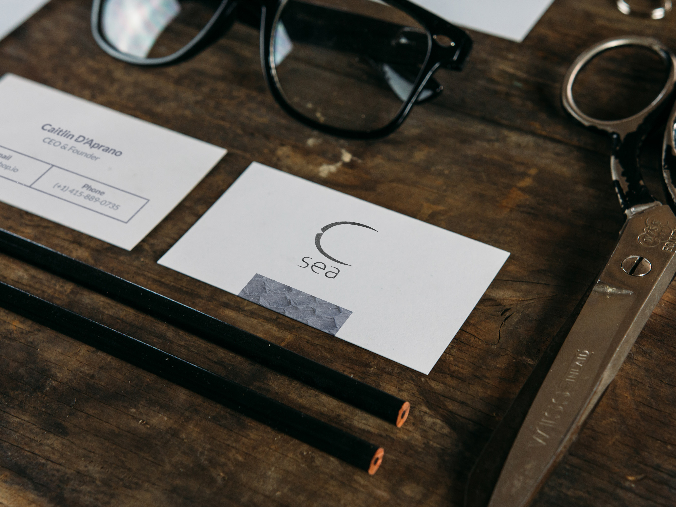
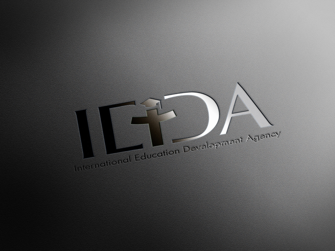
In crafting their logo, I've incorporated a ligature that beautifully encapsulates their Chinese name's essence, for the Chinese Market. At its heart, this ligature seamlessly melds the elements of the ocean and sun, symbolizing the expansive world of creativity that we embrace. It also embodies the idea of illumination and light. What sets the logo apart is its neutrality, devoid of any childlike or overly playful elements. It exudes a sense of balance and sophistication, mirroring their commitment to a design that resonates with all ages and sensibilities, offering a versatile and timeless representation of the brand.
